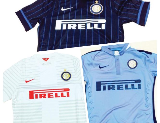
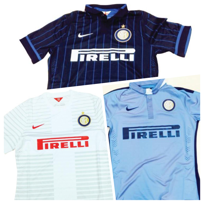
According to Tuttosport and another number of sources these will be the three Inter jersey’s which the team will wear for the 2014/15 season. A presentation will be held on the 7th July to officially launch the new designs.
Source: TuttoSport
What do you think of the kits? Lets us know below….


that 3rd is for Argentina? or Napoli? better then the red ones. and the 2nd is so lame! the first is kinda good. Yankees Baseball jersey with black and blue +_+
Why do we hate others so much?We should all share love among others,we all support Italian clubs and so should be proud of others.Why this ugly gesture towards others.Hating others is not the best way to live our lives.I am always pissed off and angry to see a true Nerrazurrian not showing good sportmanship.That is actually not what ll Capitano taught us,all Zanetti preached to Interisti is good sportmanship that is free of hatred to others.He taught us to care about others,not to always speak against them in a bad manner as many do here.Juventus,Napoli,Roma,Fiorentina,AC Milan,,,they all have a right to be there.Please it has never been a crime for a person to support a rival club,never make it look like one now.They all have their right,never lash out at someone,it is not a sportmanship behaviour.Keep this in mind“We all have the right to love&follow the team we love best”.I know a lot of people here will crucify me for the message,thanks for the criticism,they all make us grow stronger.“A WORD,THEY SAY IS ENOUGH FOR THE WISE”Think it well&wisely.God bless you all(AMEN)
Go fuck yourself..
Its a great plan from Mazzarri to change Inter to Napoli, first buy half of their team, second change their kit to look similar to Napoli’s… smh
Mazzari have nothing to do with the jersey we are to use for the season¬ even for a match
The light blue is the 3rd kit, why bother? It’s better than having a red kit
i read it was moratti who requested the pin striped jersey so keep that in mind as you criticise it
Hopefully it’s just another jokes of TS… Sighhh…
Don’t understand the hate, there is only so much you can do with black and blue stripes and this is something different. It’s still black and blue stripes but in different proportions. The away kit is nice, a homage to the Ambrosiana kit we had in 07/08. Not a fan of the third kit though.
Crisis of identity. Now we are similar with Napoli and Lazio with these shirts. The home jersey is really sucks, i thought it was a pajama on the first sight. Cmon, we are nerrazzuri, not dark and blue crayon stripes shit. I envy a lot on bilan’s home jersey, looks great and neat. Anyway, Mazzarri will be very happy as he can imagine that Inter has become with the sky blue gay shirt. The worst design of inter’s shirts i’ve ever seen for years.
The home kit is not that bad and i like it but prefered more black & blue inside on it but anyway i am gonna used to it and the 3rd one reminds me a little about fucking Napoli and dislike it
Golf shirt, Milan, and Napoli. No nerazzurro to be seen. The away red/white is especially surprising. Did we make our feelings about Milan colors known a few years back?
They all look nice actually.. 😉
the first one looks like my pajamas
Where are the black stripes?
why so fucking ugly??? :(((( who design this shit seriously, ok change the club, invest, balance the books and get a few good players that we haven’t seen yet bet !!!
but please don’t fuck our shirt :((((((( it looks nothing like inter,
This is TOO Napoli. This is for real???
standard
Inters jersey colours are Black and Blue stripes, NOT Black with a Blue pin stripe. Its not a baseball team. It would be OK as a third jersey or maybe a Europa League version, but the standard jersey should be more Classical.
i’ll wait with any judgement til i see them on our players. the home takes time to get used to, the away is really interesting (in a good way, for me)
They look f****ing dope! Haters always gotta hate.. Inter 4ever if u dont like -byebye.. Losers
Retard!
Suck my dick sucker
i think d first one which is d home jersey is pretty much ok. as 4 d other two i think we will get use to them
worse jersey ever made by INTER, no tradition at all, feels like we want to be someone else…..
Better than the snake shit or the shit we had when we won the CL!!!
that ‘snake shit’ aka. the serpent is the symbol if Milano…
It’s the symbol of Inter if I’m not mistaken, not Milano.
I actually really like the 3rd kit. It’s Nice to have something different than white. I really like our homekit aswell, but I agree , it doesn’t have the Inter-feel yet. But that will change when we Get used to it 🙂 stay positive Interisti 🙂
for the white one i am ok as the away jersey, but when it comes to the 1st, !!! damn i dont see our Black and Blue tradition
did lazio and fulham changed their main sponsor to Pirelli? LOL
and where is the “Nerazzurri”? I don’t see any black-blue combination.
we need to follow trend in order to survive. but some thing ain’t meant to change. we have tradition with “Nerazzurri”, and we must keep it that way. it’s our identity!
I’m pretty sure that the colors of the home jersey are still black and blue.
well, surely there ain’t black on the top shirt above. it’s rather small blue strip with larger very-dark-blue, but surely it’s not black.
I don’t quite care about the 2nd and 3rd shirt, they can give any color they like. but it must be “Nerazzurri” for the 1st kit, black and blue.
The second is truly shat. Hate it.
i think they all look pretty good
Loving the home one, looks fresh.
The white jersey is alright and I’m not so happy with the third one.
seriously the dark one looks like baseball jersey , what the hell is wrong with nike designer
I like one and 3, but number 2 Ill have to Get used to:-)
All shit!
I agree with you
The Home, okay 7/10, but the away,and the third, BIG MEH! looks like napoli and i hate it. Hope its not official, i wont Buy the 2nd and the 3rd.
i prefer the fan Made One, that published a month ago.
please sempreinter.com, send the Club the message, that we dont like this kit before its official.
where is the black color??!?!??!
Pure shit.. The dark one is just ugly.. And the lightblue one is another step from Mazzarri to make Inter into Napoli??? For the first time in 10 years i will NOT buy the homekit…dissaponited!!!!
@steve LoL but true. Napolization is about to happen
Reminds me of Mancester City. Could be part of Jovetic deal?
I like the dark ones, but hate the other 2, won’t buy any of them because I’ve seen and bought much better in the past.
Anyway, the worst design we’ve had in years.