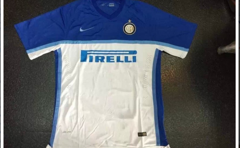
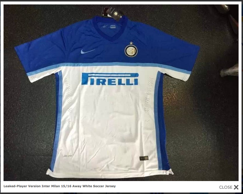
There are currently images circulating around the internet that claim to be the leaked versions of the shirts that Nike has made for the Nerazzurri will wear in the 2015-2016 season. The shirts continue the trend of reimagining the Inter shirt and both are very different from anything we have seen in the last few seasons. The images included in this article were located on “moreshirt.com”. The above jersey is a mainly white away shirt with blue on the shoulders and down the sides. This shirt is slightly reminiscent of the 1996-97 Umbro kit.
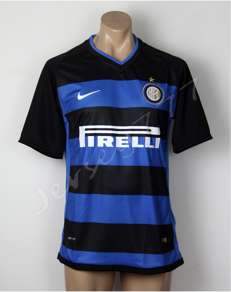
Moreover, the home shirt departs even further from the traditional vertical striping with a thick horizontal black and blue striped shirt. This shirt is similar to the horizontal striped shirts that Inter sported between 2004-2006. However, it is important to note that these versions are only rumoured to be leaked versions of next years shirt. Time will tell whether this is true or not.
Source: FcInterNews.it
Editor’s note: Personally I am not particularly fond of either shirt. I prefer the traditional vertical striping and have always loved the look of a shirt with a collar. I would have loved to see a completely black version of the Europa League shirt that Inter wore this season. Clean, collared and simple. What do you think about the above shirts? What would your ideal Inter shirt look like? Let us know below!


Guys calm down, it doesnt matter what you are wearing if you cant beat empoli. Rather improve performance than have the nicest home and away kits in europe by rankings and still cant make it to CL. My opinion
I will not buy this ugly t shirt, i m sorry but is really bad ! The sales of t shirts will really drop this year!
especially the white one looks like training t shirts.. horizontal stripes are fine but not like this this looks so poor
Ridiculous. Hope it’s a joke.
Shirts are OK from a neutral perspective, BUT has nothing to to with Inter.
Inter should return to basics instead. Simple black and azzurri even sized vertical stripes with no fancy stuff. I understand we need to strengthen the brand, but there is no reason to completely re-invent it. It will cause more damage than good.
disastrous!
It looks fine
Design is very poor class…
Awful. Both of them are simply ugly. Wouldn’t mind to experiment with away or the third jersey but the black and blue vertical stripes HAS to stay.
Thohir has change the logo. Now he is changing the tradition!? We are not Celtic or Leverkusen with horizontal strips, we are Inter. We are vertical dam it. Whats next Mr. Thohir! Change the color?
That’s nike not Thohir bro they’re doing it to Barça as well
meh.. it’s look ugly..
fake
Ugly as fuuuu
I won’t believe unless the leaks come from footyheadlines 😛
Lol exactly how I feel bro! But I wouldn’t doubt these cause Basuralona switched from vertical to horizontal and I have a feeling that ours will for this season as well
Yeah, I realized that too. I’m not against this horizontal stripes idea. It will look nice once the proper leaks come out.
Wait till you see what adidas is gonna do for there cleats next winter it’s gonna be depressing they’re getting rid of predators, nitro charges, and adi pro’s the future is here… I just hope inter kits go back to vertical after next season I like the idea of trying new stuff but don’t forget tradition
Probably the worst jersey in Inter history.. Totally dope.
If these are the jerseys, we’re gonna end up lookin like pescara lol