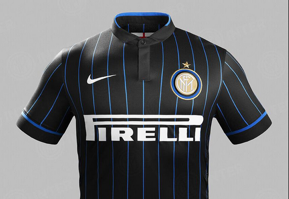
It may not have won the supporters’ affection at first glance, as many viewed the black shirt with blue pinstripes as a design that is not very representative of the classical Inter home kit. However the new Nerazzurri home jersey earned a very high position on the list of the new season’s 20 best-looking kits put together by the site Soccerbible.com a few days ago. The black and blue shirt placed second, only beaten by the new away kit of AC Milan. Inter’s new away kit also made the list, finishing as number nine.
Source: FcInterNews.it


Red is the color of Milan (the city), and is a part of our history. During WW2, when our name (Internazionale->Ambrosiana) was banned by politicians, this became our colors. In 2008 we also used this colors (Inter 100 years) to celebrate our history.
I love it. It signifies a New Era. So different from everybody else, but yet elegant. I saw the ESPN comentarist talking about the away jersey the other day, during the Inter-Roma game, and they were very complimentary.
Honestly, I do not like this new home and away jersey. Too dark and lacks of blue color. Blue stripes should have been bolder. Regarding an away jersey, I would prefer blue or dark blue colored names and numbers instead of red. RED is not our color!
I disagree. It more looks like a black pajamas to me.
hope it will boost our merchandise sales. nice work again by Inter management