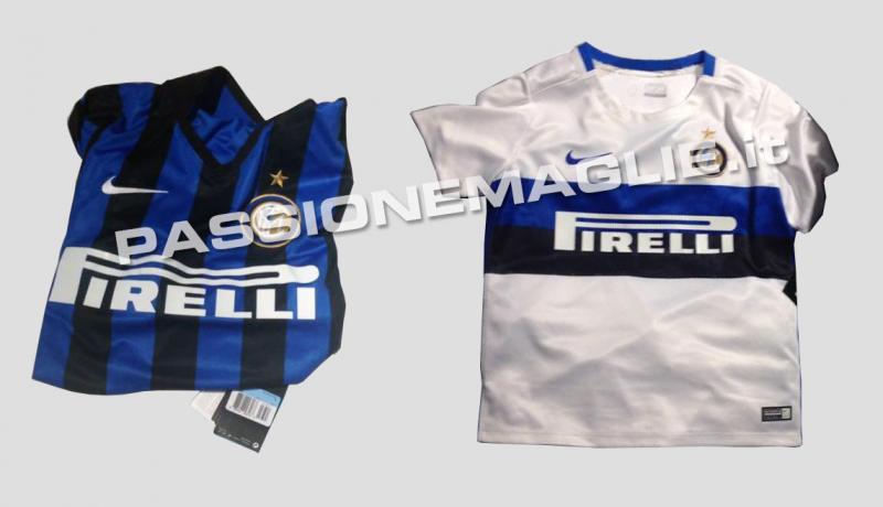

Leaked photos show Nike’s idea for next season’s Inter shirts 2015-16, and it shows a return to the club’s classic style.
This season’s shirt cause some controversy for the thin light blue stripes which did not resemble the Inter shirts of old.
The first photographs leaked by Passionemaglie.it suggest Nike have taken this on board and gone back to basics.
The new shirt will have the classic wide vertical black and blue stripes.
The away shirt is white with a large blue and black stripe across the chest similar to the one worn when Inter won the European Cup in 1965 and the treble in 2010.
Source: Passionemalie.it


Classic style is the best one, jersey for the current season is good but not as good as the classic one. I’m happy that Inter is returning to the classic one.
Classic style is the best one, jersey for the current season is good but not as good as the classic one. I’m happy that Inter is returning to the classic one.
i actually really liked the new version of the kit that is used today..
i actually really liked the new version of the kit that is used today..
Great news. I’m happy it’s not gonna be those rumored horizontal strips kits. Keep it original. This year’s shirts are not Inter. This is not a fashion show.
Great news. I’m happy it’s not gonna be those rumored horizontal strips kits. Keep it original. This year’s shirts are not Inter. This is not a fashion show.
Wow, this looks so nice. I really do not like this year’s and the past 2 years of kits. I will definitely buy the next year’s kit if they really release this look kit.
I agree. I like also like more traditional shirts
I agree. I like also like more traditional shirts
I hope the fonts will be attractive
I hope the fonts will be attractive
I hope the fonts will be attractive
I miss the 1st and 2nd kit of 2011, Those two have been the best kits that I’ve ever seen.
Best thing about the 2011 shirt was that we had every single “Champion” badge in the world 😀 The design was also great, but to be honest, I only liked the home version, the away ones with “il biscione” were a bit too much for me.
Serie A, Coppa, CL, World Champions. I have one of those, most precious piece of clothing I’ve ever worn 🙂
Oh come on bro! I still have one away kit from that year 😀
Oh come on bro! I still have one away kit from that year 😀
Sorry 😀
I actually got used to the new ones. But last year’s darker kits are also beautiful.
Not only have I gotten used to these new kits, I think they’re fantastic. We have some of the best looking kits in the world right now.
Not only have I gotten used to these new kits, I think they’re fantastic. We have some of the best looking kits in the world right now.
I actually got used to the new ones. But last year’s darker kits are also beautiful.
I actually like this year’s kits…But if we are to return to the old style, these are not too shabby. Here is a better picture: http://www.footyheadlines.com/2015/02/nike-inter-15-16-kits.html
I actually like this year’s kits…But if we are to return to the old style, these are not too shabby. Here is a better picture: http://www.footyheadlines.com/2015/02/nike-inter-15-16-kits.html
yes please, thats what i call a real inter shirt!
Those who look to the past too often are those with no future. I like our shirts this year and i hope we can keep it fresh next year as well.
Those who look to the past too often are those with no future. I like our shirts this year and i hope we can keep it fresh next year as well.
Compared to this, those look like shit. Such a shame, this year’s shirts are phenomenal. The Duomo is the symbol of Milano, the phrase “Ti te dominet Milano” will never sound more true.
The away ones are decent, though. Better than this year’s.
yes this is awesome
yes this is awesome
yes this is awesome
This is what I’m talking about. There’s so many fresh, elegant, unorthodox, creative opportunities. Not same simple, classic, uninteresting, recycled things.
I like these too:
Aye, I couldn’t decide between the two, but I prefer the Duomo ones because of the symbolic meaning 🙂
Aye, I couldn’t decide between the two, but I prefer the Duomo ones because of the symbolic meaning 🙂
Aye, I couldn’t decide between the two, but I prefer the Duomo ones because of the symbolic meaning 🙂
I agree ! We need cool modern kits ! Like this years arsenal kit . It looks awesome
I agree ! We need cool modern kits ! Like this years arsenal kit . It looks awesome
I agree ! We need cool modern kits ! Like this years arsenal kit . It looks awesome
This is what I’m talking about. There’s so many fresh, elegant, unorthodox, creative opportunities. Not same simple, classic, uninteresting, recycled things.
I like these too:
How an original Inter’s kit look like shit to you??
“shit” was a poor choice for figure of speech on my part… but I think we should move forward a bit, especially when there are interesting designs similar to the one I’ve posted.
“shit” was a poor choice for figure of speech on my part… but I think we should move forward a bit, especially when there are interesting designs similar to the one I’ve posted.
“shit” was a poor choice for figure of speech on my part… but I think we should move forward a bit, especially when there are interesting designs similar to the one I’ve posted.
Compared to this, those look like shit. Such a shame, this year’s shirts are phenomenal. The Duomo is the symbol of Milano, the phrase “Ti te dominet Milano” will never sound more true.
The away ones are decent, though. Better than this year’s.