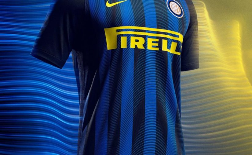

Inter unveiled their home and away kits for the 2016-2017 season. While the yellow on the shirt and the yellow socks are not approved unanimously by the fans, Fox Sports seem to have a different opinion.
Fox used words like gorgeous, amazing to describe the gold pirelli logo on the front of the shirt. On the sleeves we can read in the article: “the current Nike template with the different color sleeves may have made some international jerseys look bad, but it’s perfect for the Inter Milan kit.” Fox Sports also found unique and creative the black and blue trim on the away kit.
Source: Fox Sports


interesting… but whats up with these rumours going on about wanda talking bout inter offering icardi for sale to certain clubs like arsenal, tottenham or atletico??
would be also nice to read something about that… i just hope its some bs…
that bitch wife agent cunt finally did it and arrange icardi transfer. farewell icardi but nothing good will come in the future if u continue to listen to that golddiger…
The yellow is Amazing…hope we dont have DRIVER on the back thow..
looks good to me
“ValentinoRossi46” like this!
i love the circular pattern on the home kit, but i love how harmonious the away kit are more..
The shirt is awesome.
Don’t really value the opinion of Fox Sport, and absolutely dislike the new home shirt. I don’t mind experimenting with the 2nd and 3rd shirt, but don’t mess with the black and blue. Just keep it simple and stay away from strange vertical stripes and total black sleeves. I was hoping all along for a classic old school look, and now have to look at this all year. Oh well, if this is the only complaint I’ll have this season, I guess I can live with it.. FORZA INTER
Very important to know what “Fox sports” things…*facedesk’
i agree, but i dislike the yellow socks and the driver at the back of the shirt
They haven’t a sponsor on the back now have they? Oh god they’ve ruined the shirts
they have driver written under the kit number