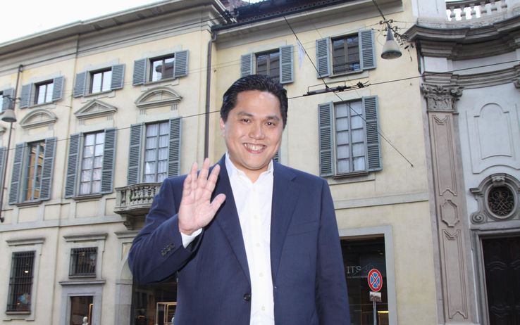
In today’s edition of La Repubblica it’s revealed how Erick Thohir plans to relieve Inter’s debts of about 180 million. The newspaper reports that Inter’s president will move the debts to two foreign banks (instead of the current four Italian) and Inter as a club will be used as collateral. The challenge to increase the club’s revenue and restore the budget remains.
The other news is regarding the club’s logo, which this summer will be reviewed, but in this case it is not a revolution. Thohir continues to make his mark at Inter step by step.
Source: fcinternews.it


I think that the logo won’t change completely btu it will be more fashioned but it will still be the same logo!
Maybe 3 stars on the top of logo 🙂
yea lets move on from snakes and go to tigers or puma’s or something. xD
Dammit they better not change the logo I got a $10,000.00 diamond inter chain with that logo -__- and I just got it a week ago fml
dude i have to see that.
check my twitter page @CurvaNordUSA or my instagram YoungAssassinVA bro it’s pretty sick!
Awesome!
Here is some illustration, we all know man.united logos nowadays but many doesn’t know that before their current one they have today, their old logo are disgusting, Go check it on your own. And what are their nicknames before the red devils? It’s busby babes! Sounds like not too manly aren’t they? But look at after they change logo and nickname and went global, they’re one of the most popular club in the world right now. What is the reaction of their hardcore fans that day about the logo changing? They’re going crazy, but in the end no one would protest about it today.
Same thing goes for Inter, don’t get me wrong, i didn’t say that our logo and nickname is bad, but referring to global business, shape are easier to remember more than alphabets, just look at the logo of epl clubs compared to serie-a clubs. Club with shapes as their logos are easier to recognize for many people. As for Inter perhaps we can use the madoninna angel as our logo, or la beneamata snake. It’s not like i really wanted us to change the logo though, i just can’t imagine the success that man.united gain from going global happen to Inter too. We will be more famous than any other clubs i do believe.
Very good point…
http://store.inter.it/it/inter-pin-biscione.html
We’ve already had Il Biscione in the past… This logo is a great piece of work, I wouldn’t like to see it changed.
I know that we had the snake logo in the old days but that logo aren’t bold and catchy in the eye, we need something more striking, ever look at the emblem of dodge viper? Something like that will be great i believe but i’d love the angel possibilities as logo too haha
Yeah small changes would be ok 😉
Nice move Mr president! United will stand, we r behind you
Agree, we are behind you Mr President
Yes, please change the logo. I am a graphic designer and my opinion the color is sucks. White color for “IMFC” initials with bright yellow as the background? that’s the worst.
Yeah hope we are not gonna change the logo!
well I’m sure that the core logo would be the same. maybe small change like position of the star, circle, etc.
well I think it’s okay to change the logo.
last time we change the logo, we started to win something after years.